 01
01In-Person Design or Paint Consultation
An hour in your home in the Charlotte area, with the decks held against the floors, stone, and trim you’re keeping.
Interior, exterior, or both.
Explore the In-Person Consultation
03 · Paint color consultations
Three ways to do it: paint colors over video for the rooms inside or the outside of the house, an hour in your house in the Charlotte area, or a color direction for an entire community.

Three ways to do it
What changes is how the colors are read: in your home, over video from your photographs, or across a whole community. Available in person in the Charlotte area or virtually nationwide.
01An hour in your home in the Charlotte area, with the decks held against the floors, stone, and trim you’re keeping.
Interior, exterior, or both.
Explore the In-Person Consultation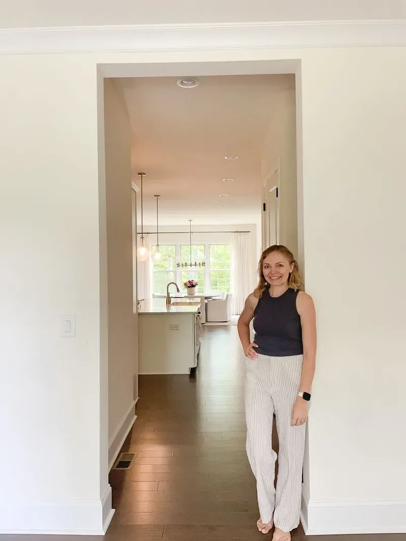 02
02Wall, trim, ceiling and cabinetry colors for the rooms inside, or exterior colors chosen against the roof, brick and stone you’re not replacing.
Held over video, anywhere in the country.
Explore the Virtual Paint Consultation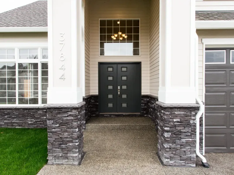 03
03A color direction for a whole community or a new development, with coordinated Sherwin-Williams palettes that make approvals and selections simpler.
Explore HOA & Builder Support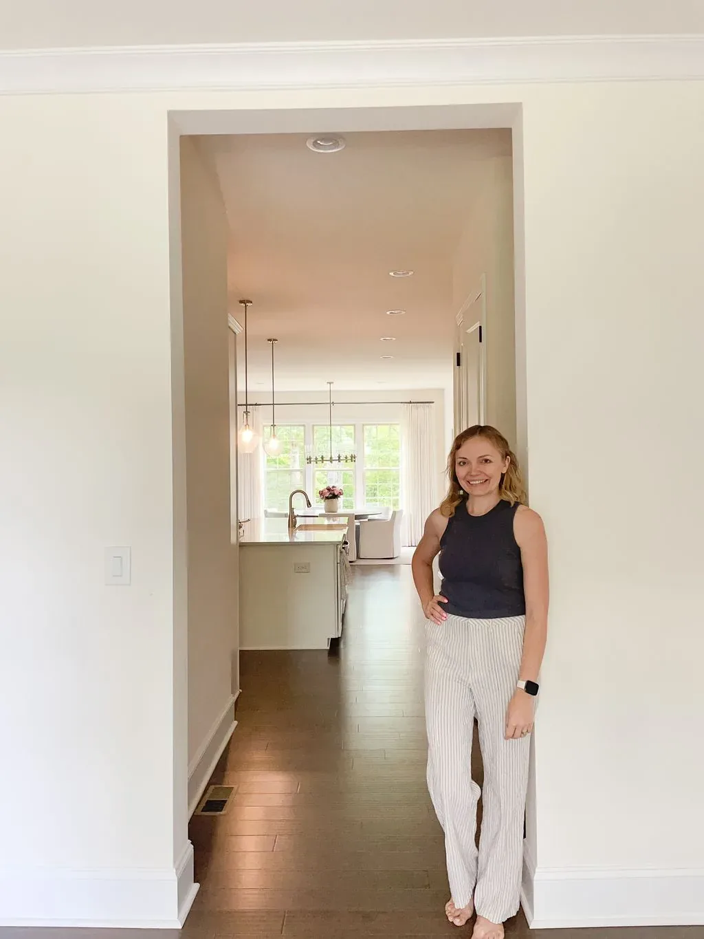 Paint Color Consultations
What it includes
Paint colors change with lighting, flooring, countertops, stone and surrounding finishes. I consider the entire home—not an isolated swatch—to create a palette that feels cohesive from room to room.
A paint consultation is a color plan for your actual house. Every wall, ceiling, trim run, door and cabinetry face in the scope gets a named color, a sheen and a place on the plan. I work from the things you are not changing — the floors, the countertops, the stone, the tile, the cabinets you are keeping — and from how daylight moves through your rooms, rather than from a chip held up under store lighting.
The failure this removes is the sample spiral. Eight sample quarts, a dozen patches on the wall, and a color that looked right at ten in the morning and went green by four. Each room ends up decided on its own, under time pressure, and when the painter leaves you can see every seam: the hallway argues with the living room, two whites sit next to each other and do not match, and the trim reads yellow against the new floor. Paint is cheap in materials and expensive in weeks — the second repaint costs you the house being unusable all over again.
Undertone is the part that is genuinely hard to see and easy to get wrong. A beige turns pink beside red oak. A soft white goes gray beside cream millwork. A gray that was right in a south-facing room turns cold and blue on the north side of the same house. Outside, the same problem runs at a larger scale: siding has to agree with brick, stone and the roof shingle you are keeping, and it has to hold up across a full elevation in direct sun — not on a two-inch chip held in the driveway.
Who it suits
You have painted a room twice already and it is still not right
A whole-house repaint, or a new house standing empty before the furniture arrives
An exterior repaint where the brick, stone and roof are staying exactly as they are
A renovation or new build where the builder needs a paint schedule by a date
What changes is how the colors are read: in your home, over video from your photographs, or across a whole community. Available in person in the Charlotte area or virtually nationwide.
How it runs
Before we meet you send photographs of each room in daylight and again at night with the lamps on, the finishes that are staying, and which way the main rooms face. For an exterior, photographs from the street and from both side elevations. This is where most of the constraints show up, and it is why the session itself can be spent deciding rather than gathering.
In the Charlotte area I bring the color decks and we hold them against your actual floors, stone and trim, room by room. Virtually, we work over video and through your photographs, nationwide. Either way the decisions are made with you in the session, so you understand why a color is on the plan and not only that it is.
You buy two or three, not fifteen. Paint them on large boards rather than in patches on the wall, then move each board around the room and look at it morning, afternoon and after dark. Hold it against the floor and the trim, not against the wall alone. This happens before the painter is booked, not during his first day.
You receive the palette in writing — color, sheen and location for each surface — in a form your painter can quote and work from. If a color is discontinued or your painter carries a different line, you have the reasoning behind each choice, so a substitution can be made without the whole scheme unravelling.
From recent work
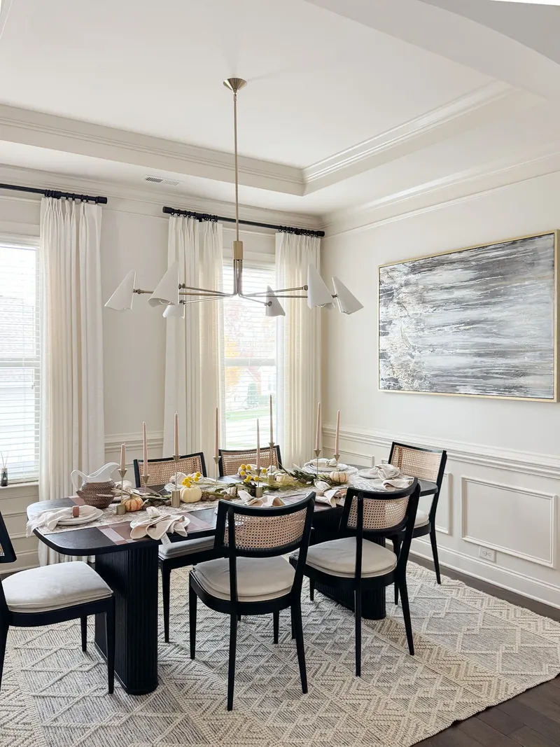
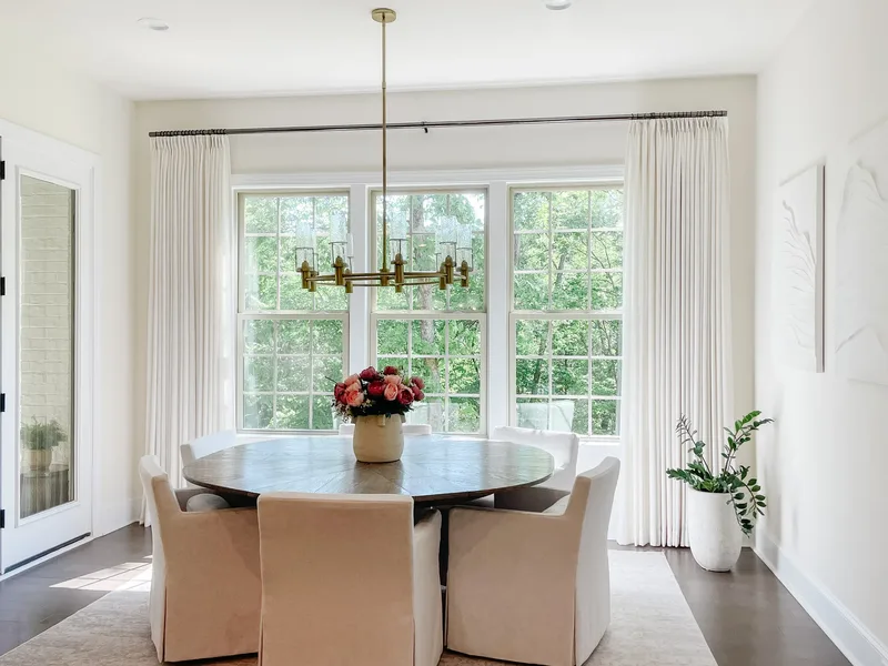
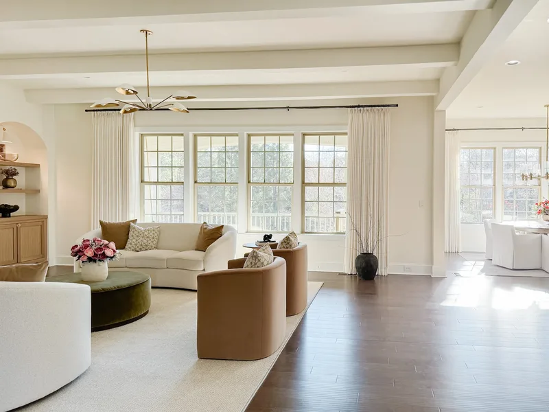
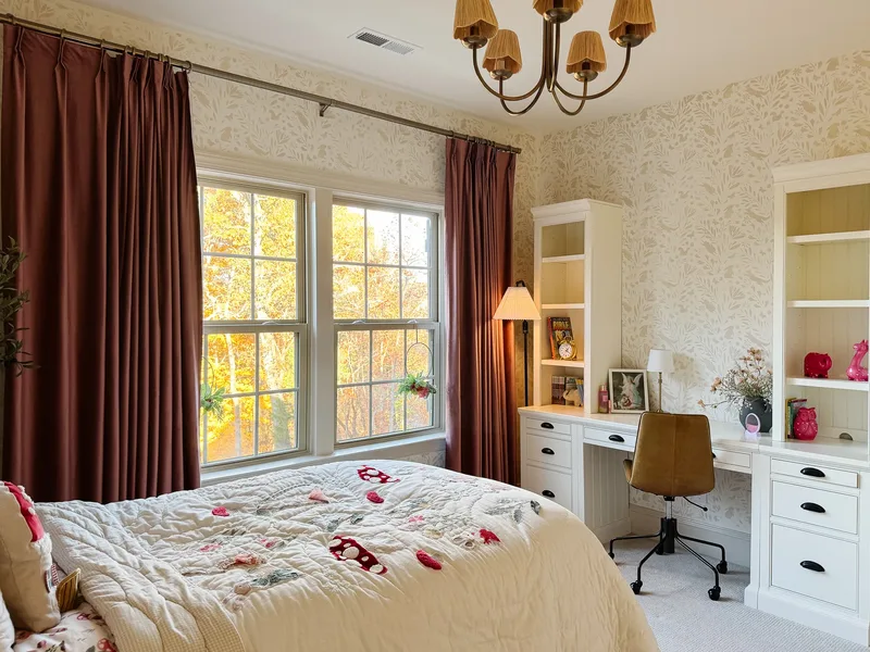
What clients say
“Tatyana saved me from my paint mistakes today. She is an excellent paint picker and designer. I had spent hours researching paint colors and she easily found me better ones in one session. She also helped me with design ideas through my house. I highly recommend!
“Tanya was incredible to work with for our home remodel! We booked a 1-hour in-home consultation, and she helped us pick the perfect paint color, light fixtures, and cabinet handles to match our new flooring and granite. She is super smart, knowledgeable, and so easy to work with. Our home looks fantastic and completely cohesive now highly recommend her!
“We’ve collaborated with Tatyana on several projects to assist homeowners in selecting the ideal colors for their homes and creating a harmonious living environment. Tatyana is exceptionally easy to work with and genuinely a pleasure to collaborate with. From our initial, straightforward communication to our absolute professionalism in the realm of colors, Tatyana consistently exceeds our expectations. We highly recommend working with Tatyana!
“Tatyana was able to help us chose paint colors for 4 rooms in our house very quickly. She picked up on our style right away and was able to translate that into the right look. She was very professional and had recommendations for painters as well.
“Tatyana was super responsive and understood what we were aiming for with the exterior of our custom build. She gave great suggestions for paint and stone and quickly threw together some images so we could visualize it. Very grateful for her!
“Tatyana was so patient with us in helping pick paint colors. We really appreciated her guiding us to find what we liked.
“Tatyana did a great job helping us pick our paint color!
“I needed desperate help with paint color for our exterior new build home. Tricky part was (for me) the roof the outside doors and garage doors and windows were all in and addition to some stone also!! so I had a partial color scheme going but was stumped with a good paint color. I kept picking different colors and we would try them on the wall and it was too bright too yellow too much!! I was browsing on TT as you do and this sweet young lady came on talking about paint color and all the things I needed to hear. Reached out to her and she had no problem whatsoever nailing down 3 beautiful colors and suggesting how they would work for what we were going for and made a mood board based on the pictures I had sent her of our new build. She knows her stuff and I greatly appreciated her kindness and skillful talent. It’s no easy task matching or evening contrasting colors on such a important part of our new home. I am very thankful and feel I can always reach out to her and she will have the answer. And for me that’s worth it. The pictures I am posting is pre-painting after we have it painted I will come back and add those pics.
Before you book
Both work, and which is better depends on what the color has to match. When we are reading undertones against something fixed and expensive — brick, stone, a countertop, existing wood floors — being in the room is genuinely better, because a phone camera adjusts white balance and quietly corrects the exact undertone we are trying to judge. Wall color for open-plan rooms, whole-home continuity and exterior schemes translate well over video, as long as your photographs are taken in flat, indirect light with no filter. I work in person in the Charlotte area and virtually nationwide.
It depends on how the house is laid out rather than how large it is. An open plan usually wants one wall color carried through, one white for trim and one for ceilings, because there is no doorway at which to change. A house with real rooms and doors can hold four or five wall colors without feeling busy, since each one is seen against a threshold instead of against the next room. Most whole-home palettes come out somewhere between five and eight colors once trim, ceilings and cabinetry are counted.
Yes. I’ll mail complimentary 8 × 10 Sherwin-Williams samples of your recommended colors upon request so you can view them in your home’s lighting before making the final decision.
Anything harder to change than paint. Flooring, counters, tile, stone, cabinetry finish, and on the exterior the roof and masonry, all come in a limited number of options — paint comes in thousands. So paint is chosen to them, not the other way around. If those selections are still in progress, we can either wait or set the direction now and confirm exact colors once the samples are in your hands. Large upholstery and rugs are the exception worth raising early: if a sofa or a rug is already ordered, bring it into the conversation, because a hard-to-source textile constrains the room the same way a countertop does.
The palette is specified in Sherwin-Williams with the colour numbers, because a number removes the argument at the counter. If your painter prefers another brand they can match it, but be aware a cross-brand match is close rather than identical, and it is worth testing the matched version rather than trusting the chip.
They need their own decision, which is not the same as their own colour. Trim carried through a whole house is what makes rooms read as one house, and a ceiling that is simply the default white is a choice nobody made.
Everything you are not replacing: brick, stone, roof, and often the window frames. Those set the undertone the scheme has to live with, which is why an exterior palette is chosen against them rather than against a swatch in your hand.
By what the surface has to survive and how much light it should bounce. Every surface in the scope gets a named sheen alongside its colour, because the same colour in the wrong sheen reads as the wrong colour.
It has to, and that is the point of working from what you are keeping. Floors are among the hardest things in a house to change, so they lead the palette rather than accommodate it.
Yes, though it is rarely only the door. A door colour is read against the brick, the roof and the trim beside it, so the useful version of that question includes what it is sitting in.
A written palette: every surface in the scope with a named colour, its number and its sheen, and where it goes. It is written to be handed straight to your painter without translation.
Other ways to work together
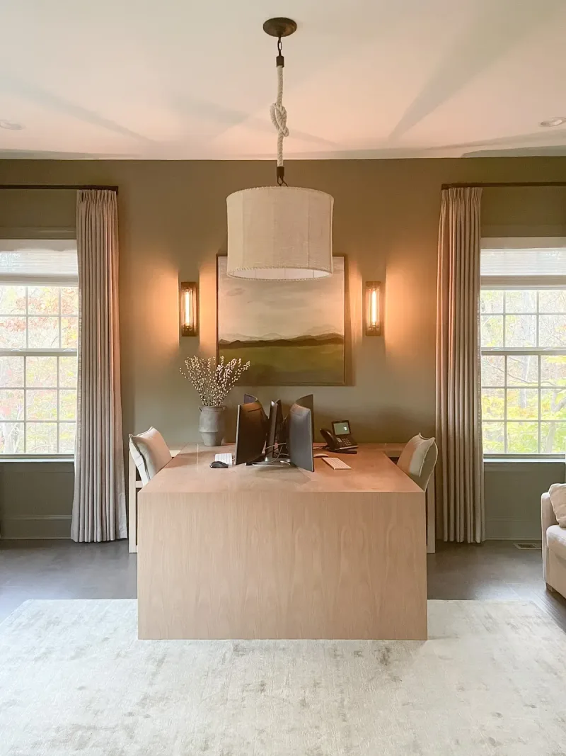 01
01From the first idea to the final detail, I manage the design process so you can enjoy a home that feels cohesive, finished, and completely yours.
Available exclusively in the Charlotte area.
Explore Full-Service Design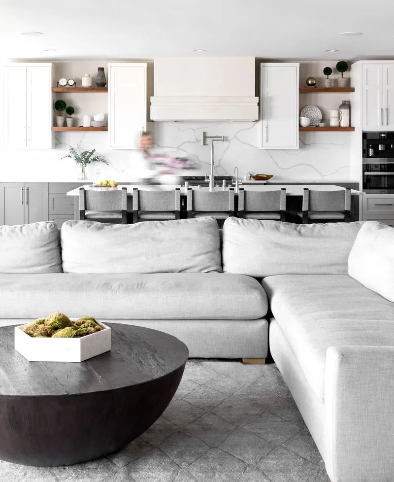 02
02Make every permanent decision with confidence before construction begins—from cabinetry and tile to lighting and finishes.
Explore Kitchen & Bath Design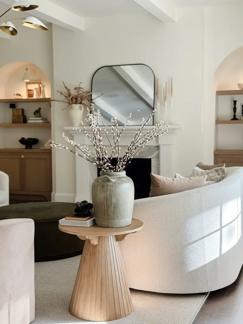 03
03Turn an unfinished room into a space that feels complete.
I help you select the right furniture, lighting, and finishing details to bring everything together.
Explore Furniture & Room Design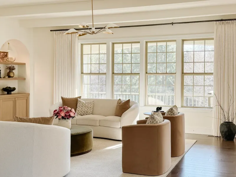 04
04During a focused consultation, we’ll work through the decisions keeping you stuck and create a clear direction you can confidently follow.
Available in person in the Charlotte area or virtually nationwide.
Explore Design Consultations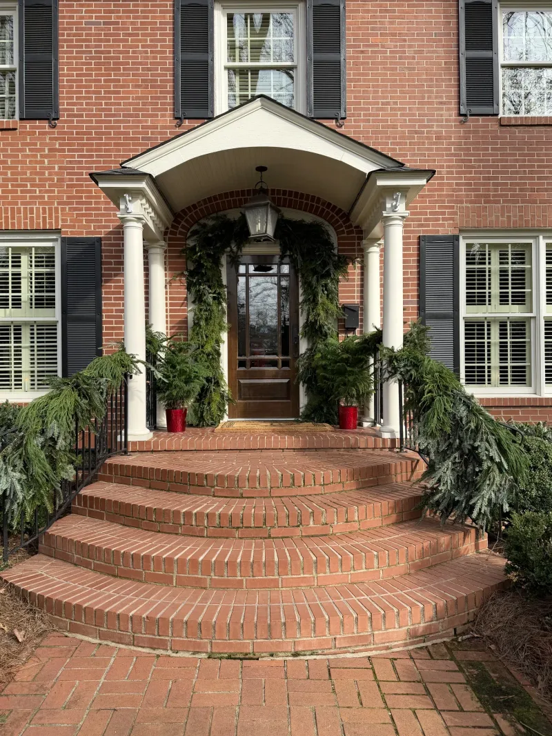 05
05Four ways to have Christmas done for you, from the tree alone to the whole house and the porch.
Everyone is quoted after I’ve seen the rooms.
Explore Seasonal Styling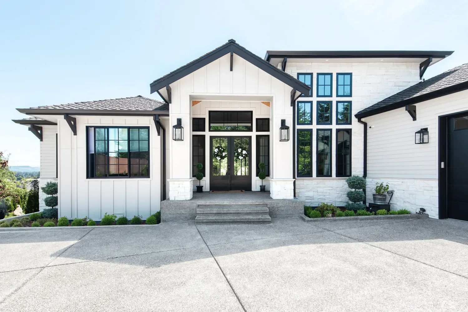
Let’s make your next decision the easy one
Tell me what you’re working on, and let’s choose the right next step together.
Let’s talk about your home
Ready to share the details? Complete the project inquiry form, and I’ll recommend the best next step.
Prefer to talk first? Book a free 15-minute call to ask about my services and see which option fits your project.

Not sure which service you need?
Book a complimentary 15-minute Project Fit Call to briefly share what you’re working on, ask questions about my services, and determine which option best fits your project.
Book a Free 15-Minute CallYou only need to choose one—submit the form or book a call.
Why color misbehaves
Paint is the cheapest thing in a renovation and the one people repaint most often. That isn't a coincidence. A two-inch chip held against a wall under a showroom's fluorescent light tells you almost nothing about how thirty gallons of that color will behave in a north-facing room with oak floors, a beige sofa and a neighbor's red brick reflecting through the window at four in the afternoon.
Color isn't a property of the paint. It's what happens when that pigment meets your light, your floors, your fixed finishes and the room next door. Which is why choosing "the perfect white" is the wrong question, and why the answer is a coordinated palette for the whole house rather than one more sample jar. Here's how color actually behaves, and how to make a decision you won't undo.
If the decision turns on an undertone against something fixed and expensive — a countertop, a slab, brick — the in-person hour is worth the drive. Everything else translates honestly to video, provided the photographs are taken in flat light with no filter.
If you would rather start with something ready-made, her premade Sherwin-Williams palettes are the least expensive way in — the same colors, chosen in advance rather than for your rooms.
Four things are happening at once, and all of them are working against a paint chip.
LRV is a number from 0 (absorbs everything) to 100 (reflects everything), and it's on the back of most fan decks. It's the most useful single number in color selection and the most misunderstood.
| LRV range | Reads as | Behaves like |
|---|---|---|
| 82–92 | White | Bounces light hard. In a dark room this is the fix. In a bright south room it can go glaring. |
| 65–81 | Off-white, pale greige | The safest band for open-plan main floors. Enough color to be a color, enough light to stay easy. |
| 50–64 | Mid-tone | Where undertone becomes obvious. Test seriously. |
| 25–49 | Deep | Wonderful in a small room you're happy to make cozier — a study, a powder room. |
| Under 25 | Near-dark | Absorbs light. Needs lamps, and needs the trim decision made deliberately. |
The practical use: in a north room, going up 8–10 LRV points does more good than changing hue. And keeping the main living spaces within roughly 10 points of each other is most of what makes an open floor plan feel calm.
The same color in the wrong sheen reads as the wrong color, because sheen changes how much light comes back at you and how visible every imperfection is.
| Surface | Sheen | Why |
|---|---|---|
| Ceilings | Flat | Hides drywall seams and roller lap; nothing rubs against a ceiling |
| Living, dining, bedrooms | Matte or eggshell | Modern matte scrubs far better than it used to; eggshell if the walls are older and uneven |
| Hallways, kids' rooms, stairs | Eggshell or satin | Hands touch these walls constantly |
| Kitchens, bathrooms | Satin | Moisture and wiping; anything glossier shows every wall flaw |
| Trim, doors, millwork | Satin or semi-gloss | Semi-gloss is traditional; satin trim reads quieter and is having a well-deserved moment |
| Cabinetry | Satin, or a cabinet-specific enamel | Hardness matters more than sheen here — this is a product decision, not just a finish one |
This is where nearly everyone goes wrong, and it costs about forty dollars to get right.
Don't paint patches directly on the wall. The existing color surrounds them and distorts what you see, and you'll have to prime over them anyway. Instead:
Then move the boards around, and look at each one:
Test three colors, not eleven. Past three, you stop comparing colors and start comparing your own fatigue. Narrowing the list is most of what a consultation does.
In an open plan you never see one wall color at a time. You see three, plus the trim, plus whatever is through the doorway. A palette handles the relationships: the main body color, one or two secondary colors for rooms that close off, a single trim color carried throughout, a ceiling decision, and an accent for millwork or interior doors.
Carrying one trim color through the whole house is the cheapest thing you can do to make a home read as designed rather than assembled. And where a wall color changes, it should change at an inside corner or a door casing — never mid-sightline, where the eye reads it as a patch someone forgot to finish.
A whole-home palette also makes touch-ups possible years later, because the list exists and every color has a number on it. Keeping a design cohesive through a remodel goes further into this.
A ceiling painted builder white because nobody decided is a decision nobody made. Options worth considering:
For trim, the two workable approaches are a crisp white that's cleaner than the walls, or trim in the same color family as the walls for a quieter, more European result. What doesn't work is a white trim with a different undertone from the white ceiling — that reads as a mistake even to people who can't say why.
Outside, you're not choosing a color. You're choosing something that has to live with everything you aren't replacing: brick, stone, roof shingles, and usually the window frames. Those set the undertone, and they're not negotiable.
Charlotte brick is the ruling constraint on most exteriors here. Older brick tends orange-red and demands warmth in the trim; newer blends are cooler and more forgiving. Hold samples against the brick in full sun and again in shade — masonry shifts more between the two than almost any other material.
Then remember exterior color reads lighter outdoors than indoors, often by a noticeable margin, because there's simply more light. A siding color chosen inside will almost always land a step paler than expected. Sheen matters too: flat or low-lustre on siding hides waviness, satin on trim and doors sheds water and cleans. The full exterior walkthrough is here, and painting brick is worth reading before committing, because it's close to irreversible.
A written palette. Every surface in the scope with a named color, its Sherwin-Williams number and its sheen, and where it goes — walls, ceiling, trim, doors, cabinetry, accent. Plus a short sample list: which two or three to buy and how to test them.
It's specified in Sherwin-Williams with numbers because a number removes the argument at the counter. If your painter prefers another brand they can match it, but a cross-brand match is close rather than identical, and it's worth testing the matched version rather than trusting the chip. The full list of what's included is on this page.
These come up constantly, and each has a full write-up. Agreeable Gray is the most-used greige in America and goes cold in north light more often than people expect. Accessible Beige is its warmer sibling and usually the better answer in a room with warm floors. Sea Salt shifts between green, blue and gray depending on light more than almost any color I use. For whites, Westhighland White and Greek Villa cover most cases. And if you want depth, the dark greens piece is a good place to start.
If you'd rather buy a scheme than commission one, there are ready-made palettes in the shop, built the same way.
Painting cabinetry is not painting a wall, and treating it as one is why so many kitchen repaints look tired within two years.
The product matters more than the color. Cabinets need a hard, self-leveling enamel rather than a wall paint, because they get touched, wiped and knocked constantly. Preparation is most of the result: degreasing, deglossing or sanding, and a bonding primer suited to the existing finish. On previously factory-finished cabinets, skipping the bonding primer is how you get chipping at the door edges by month six.
On color, the two decisions are the value relationship with the counters and whether the island differs from the perimeter. A cabinet color close in value to the countertop makes a small kitchen read larger; strong contrast makes a large kitchen read more deliberate. A darker island against lighter perimeter cabinets is a reliable move, and it works in reverse too.
Expect the color to look darker on cabinetry than on a wall — more surface angles, more shadow, less reflected light. If you're between two, take the lighter one.
Keep a written record: room, surface, color name, number, sheen, and the date it was painted. Tape a copy inside a utility cabinet door. Two years from now, when a patch needs touching up, that sheet is worth more than any leftover can.
Store leftovers properly — sealed, labeled by room, somewhere that doesn't freeze. A garage in Charlotte is usually fine; an unheated shed is not. And touch up with a brush loaded lightly, feathering outward, rather than rolling a fresh patch, which will always read as a patch in anything above a flat sheen.
Order the right quantity — most interiors take two coats, and a dramatic color change may need a tinted primer rather than a third coat. Buy from the same batch where you can, and keep the leftovers labeled by room. Note the sheen on the can lid; in two years you will not remember.
If you're painting yourself, the step-by-step guide covers preparation and order of work, and limewash is worth understanding before you commit to it, because it behaves nothing like paint.
Send:
If you're mid-renovation, an hour on a virtual consultation can settle the selections that are due while the rest keeps moving. If the color question is really part of a bigger project, full interior design handles the palette as one piece of the whole, and for cabinetry and tile it's kitchen and bath.
One honest limit: reading an undertone against something you're keeping — a countertop, a stone, a floor — is the case where being in the room genuinely wins. Everything else works well over video. You can see palettes at work in A quieter palette and A Timeless First Impression.